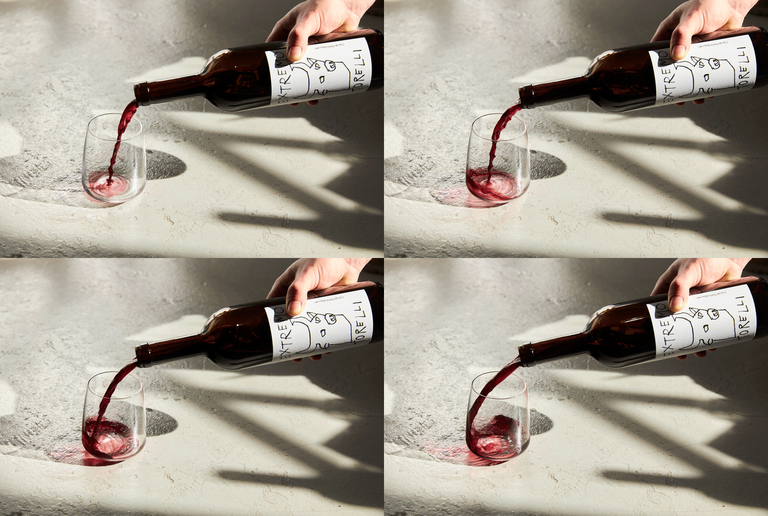
Located in the commune of Bubbio, in the Piedmont region of Italy, the Torelli family has been producing wine for four generations. Based on the principles of organic farming, their products are distributed in Quebec by the private import agency Bacchus76, a long-time collaborator of ours. To help the Torelli family attract a wider audience and better adapt to the Quebec market, we were asked to review two of their products’ labels: L’Extremo and Bubeum Macerato. The essence and personality of each of the wines guided the graphic approach of the labels.
Client
Services
Graphic Design
Collaboration


A Monferrato dry red wine produced in small quantities since 2007, L’Extremo has the particularity of being bottled without added sulphites… and without compromise, hence its name. We highlighted the artisanal side of this wine with a hand-drawn illustration. The bull, a symbol of strength and intensity, seemed perfectly suited to be its emblem. For the Bubeum Macerato label, we interpreted a geometrical landscape composed of a sun and a hill and we have honoured the orange colour of the wine with copper metallic stamping. Depending on the lighting and the reflection, it almost looks like a cut out in the label.


